skype
skype
skype
skype
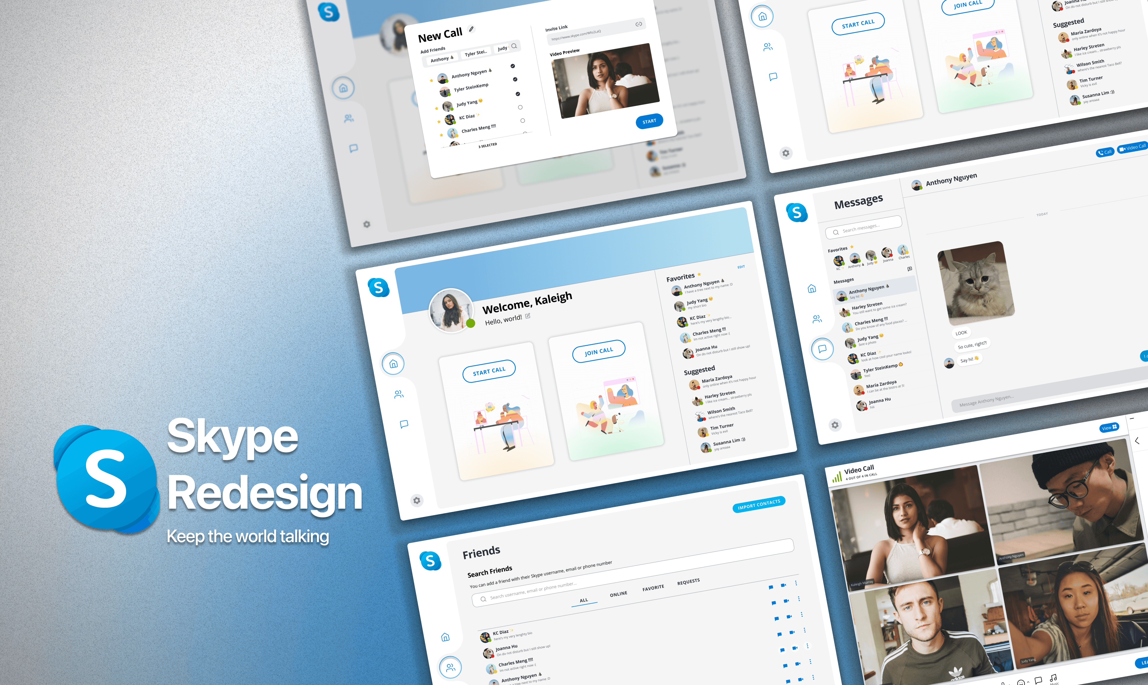
elevating remote communication. a refreshed interface of Skype.
year
2022
duration
6 weeks
category
UI/UX
credits
Krishelle D, Joanna H, Judy Y, Charles M, and Anthony N.
00


problem
problem
problem
problem
Released in 2003, Skype is a telecommunications software that allows free one-to-one or group video and voice calls. While it was highly popular in the 2000s, it gradually lost favor as remote meetings became more common. Consequently, other platforms emerged to address communication needs, leaving Skype as a less prominent option.
solution
solution
solution
solution
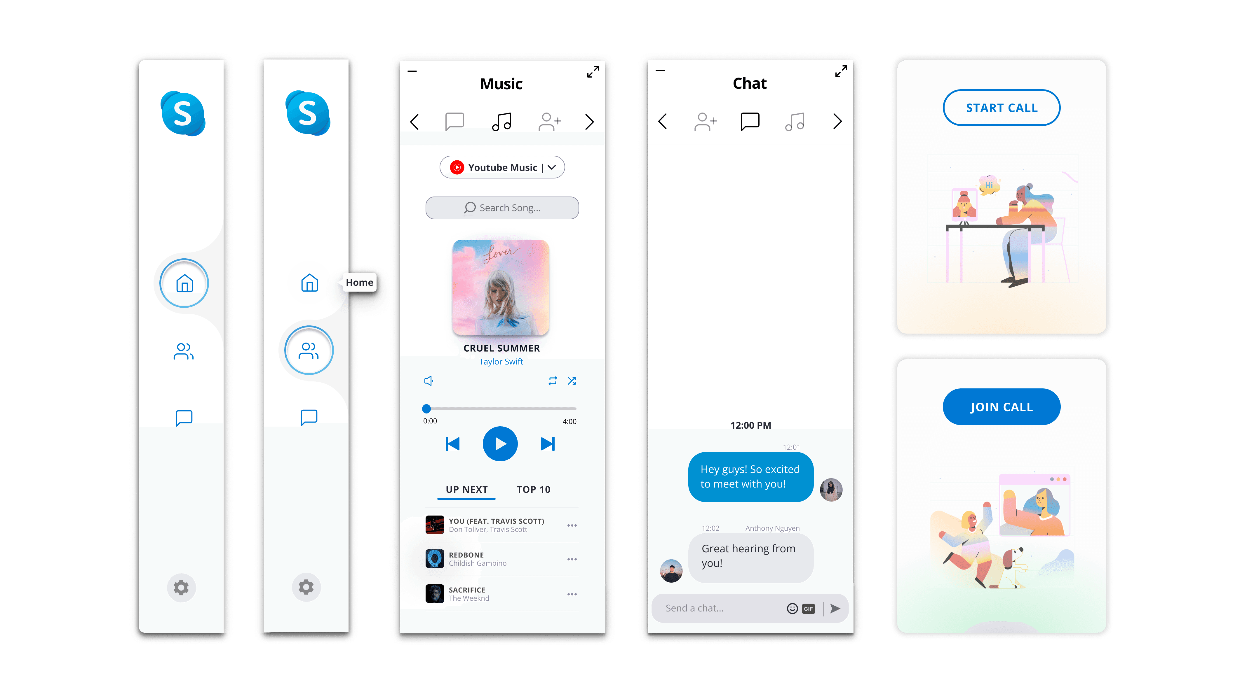
My team adopted a modern design language aligned with other popular telecommunications platforms. We aimed to clarify Skype's brand identity with a consistent visual style and clear platform intentions. We also enhanced the video call experience by adding new features, such as music sharing and a carousel sidebar.
01
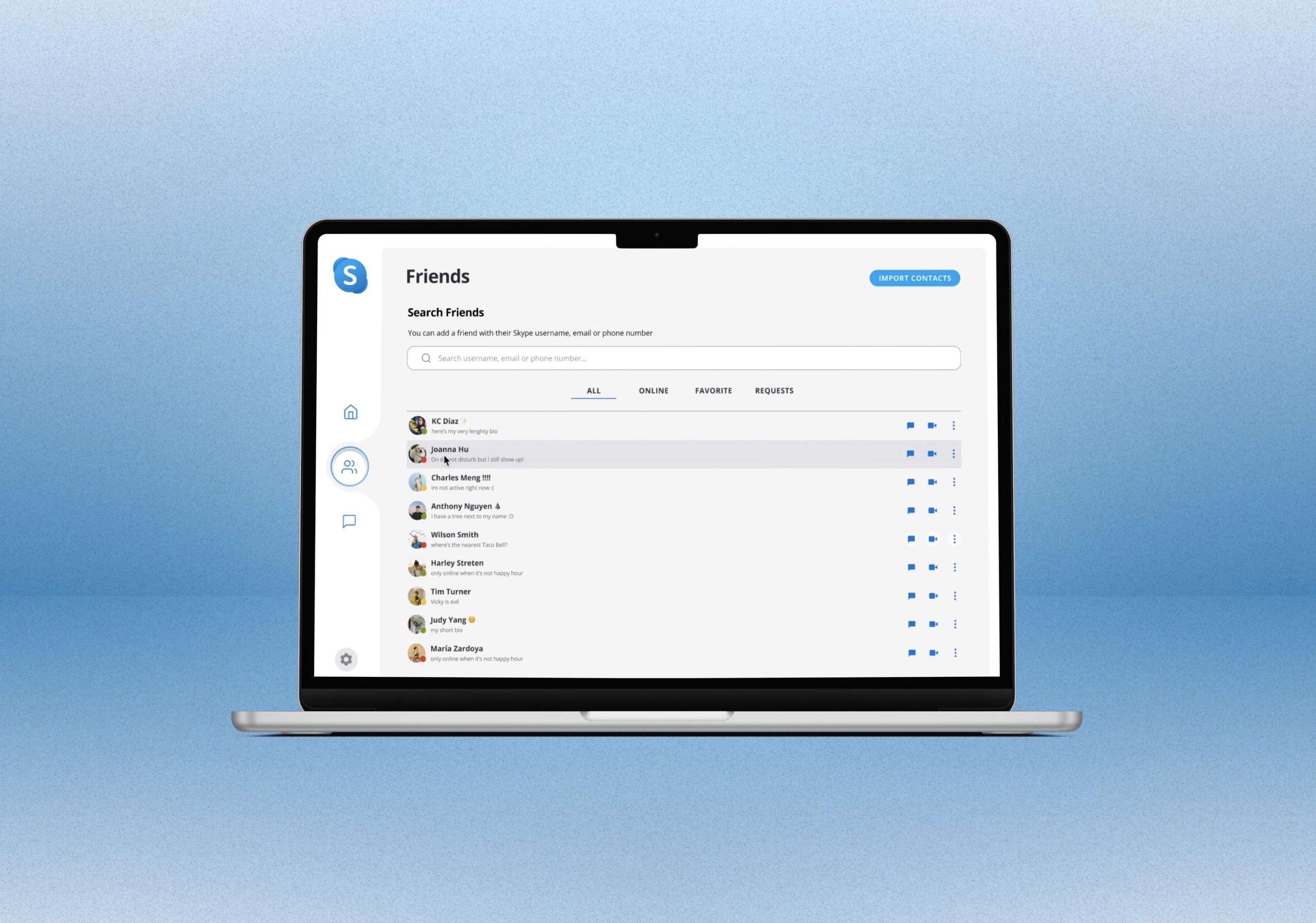


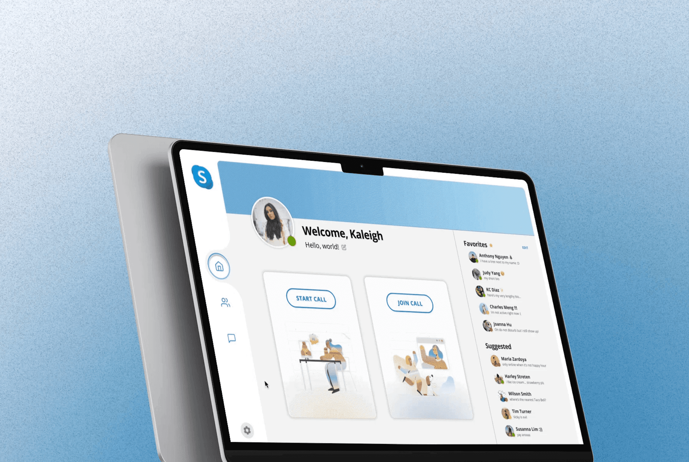
Over six weeks, I researched why Skype lost popularity and developed a solution to restore its prominence in telecommunications. My team and I presented our findings at Presentation Day, hosted by Design Interactive and sponsored by Netflix. Our presentation was well-received by industry professionals, and we were honored to win the Best UX Research Award.
Timeline

Understanding Business Value
Before conducting our research, I analyzed Skype's history and changes over time to better understand its business values. In recent years, Skype has lost popularity to newer platforms like Zoom and Google Meet.
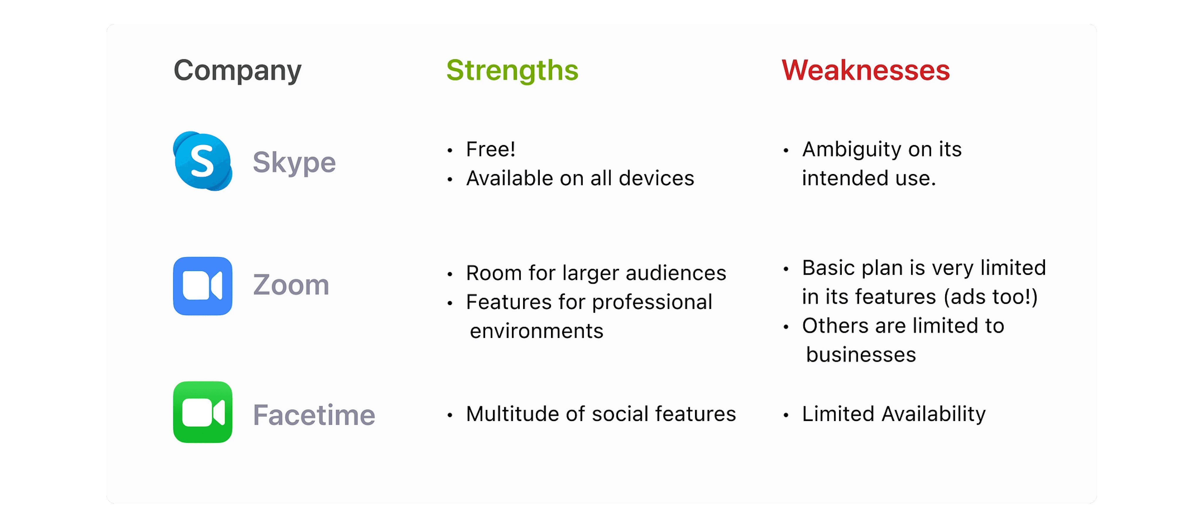
There are a few reasons for this decline. First, the platform has become cluttered and difficult to use. Second, Skype's target market is not clear. The platform is trying to be both professional and social, which makes it difficult to define who it is marketed for.
To revitalize Skype, these values should include:
01 Convenience
Skype should be easy to use and navigate. Users should be able to find the features they need quickly and easily.
02 Security
Skype should be a secure platform for communication. Users should be confident that their data is safe.
03 Affordability
Skype should be an affordable platform for communication. Users should be able to use the platform without breaking the bank.
04 Scalability
Skype should be a scalable platform. The platform should be able to handle increasing demand without sacrificing performance.
Research
Surveys
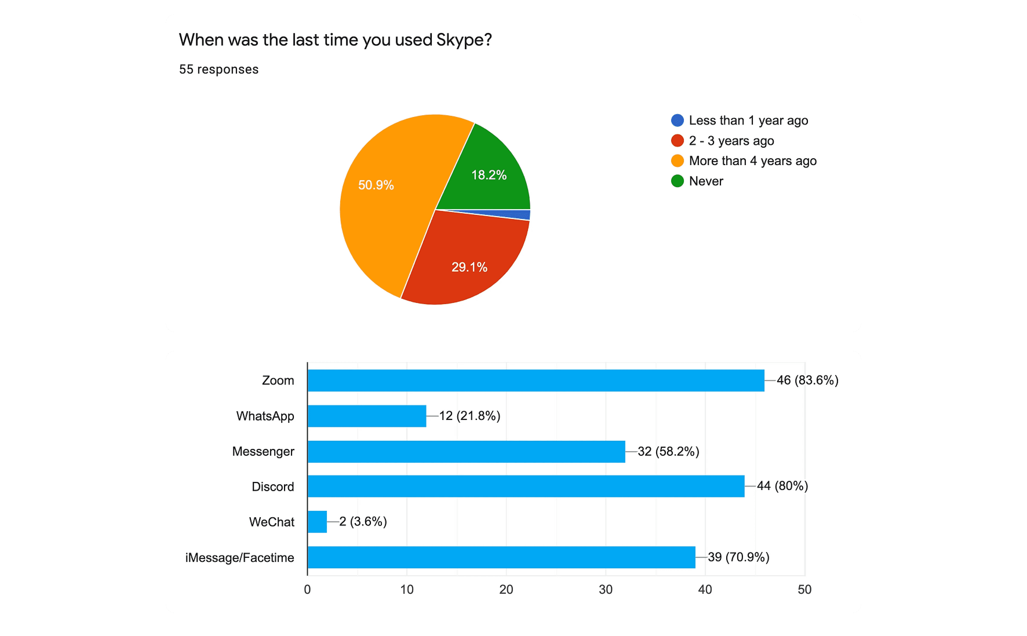
Our survey received responses mostly from college-aged students, who generally reported infrequent use of Skype. Of those who responded, 51% had not used Skype in over four years, with 29% not having used it in the last two to three years. Respondents were drawn away from Skype as new alternatives like Zoom and Facetime began to arise.
Interviews
I then interviewed college students and full-time workers in their 20s to gather qualitative data and insights about our target audience. Our research questions included the following:
01 Why do people not want to use Skype?
02 Favored vs un-favored Skype features.
03 What’s missing from Skype?
I made sure to use open-ended questions and had the interviewees perform tasks on Skype's current design to identify initial problems.
Competitive Analysis
Ideation
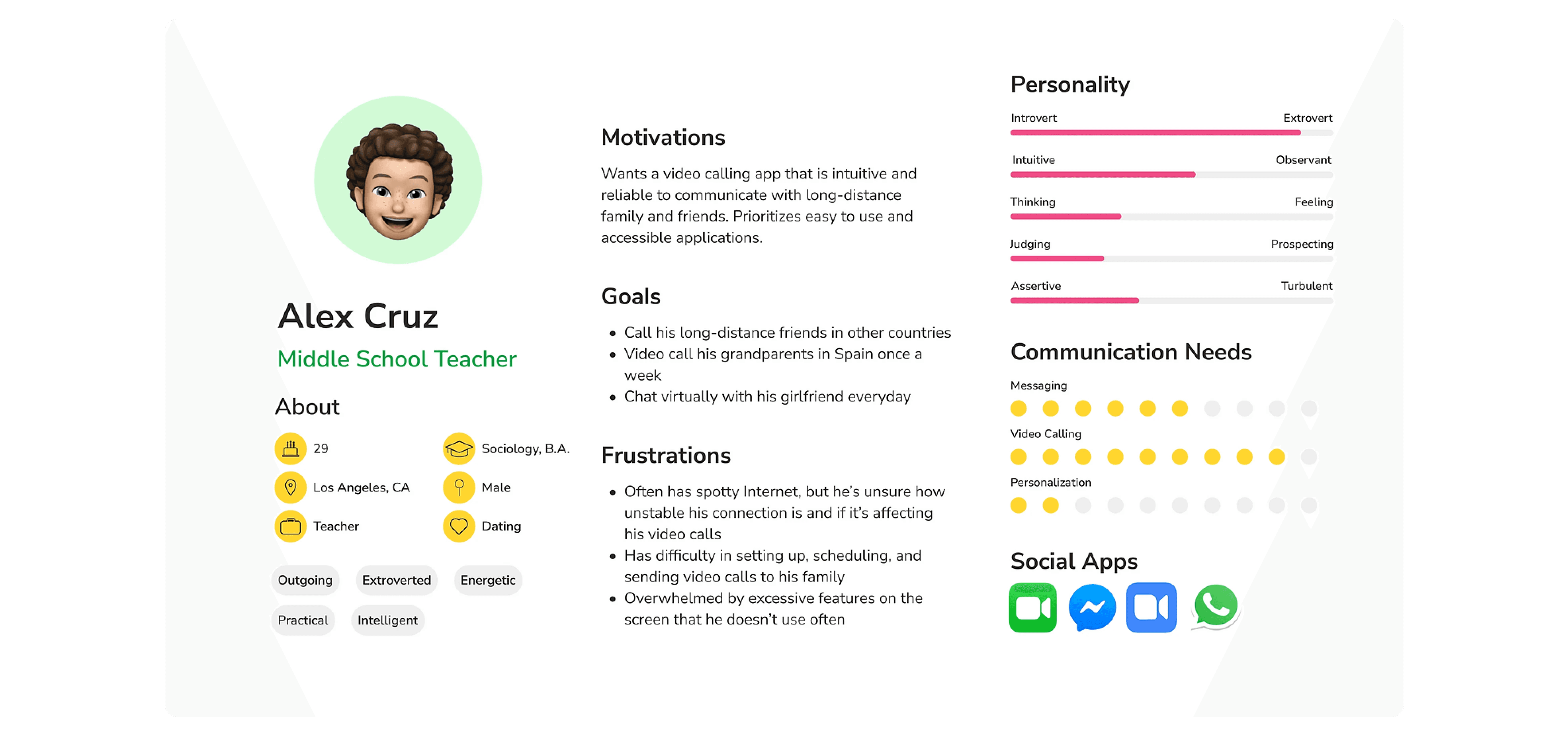
User Personas
Affinity Mapping
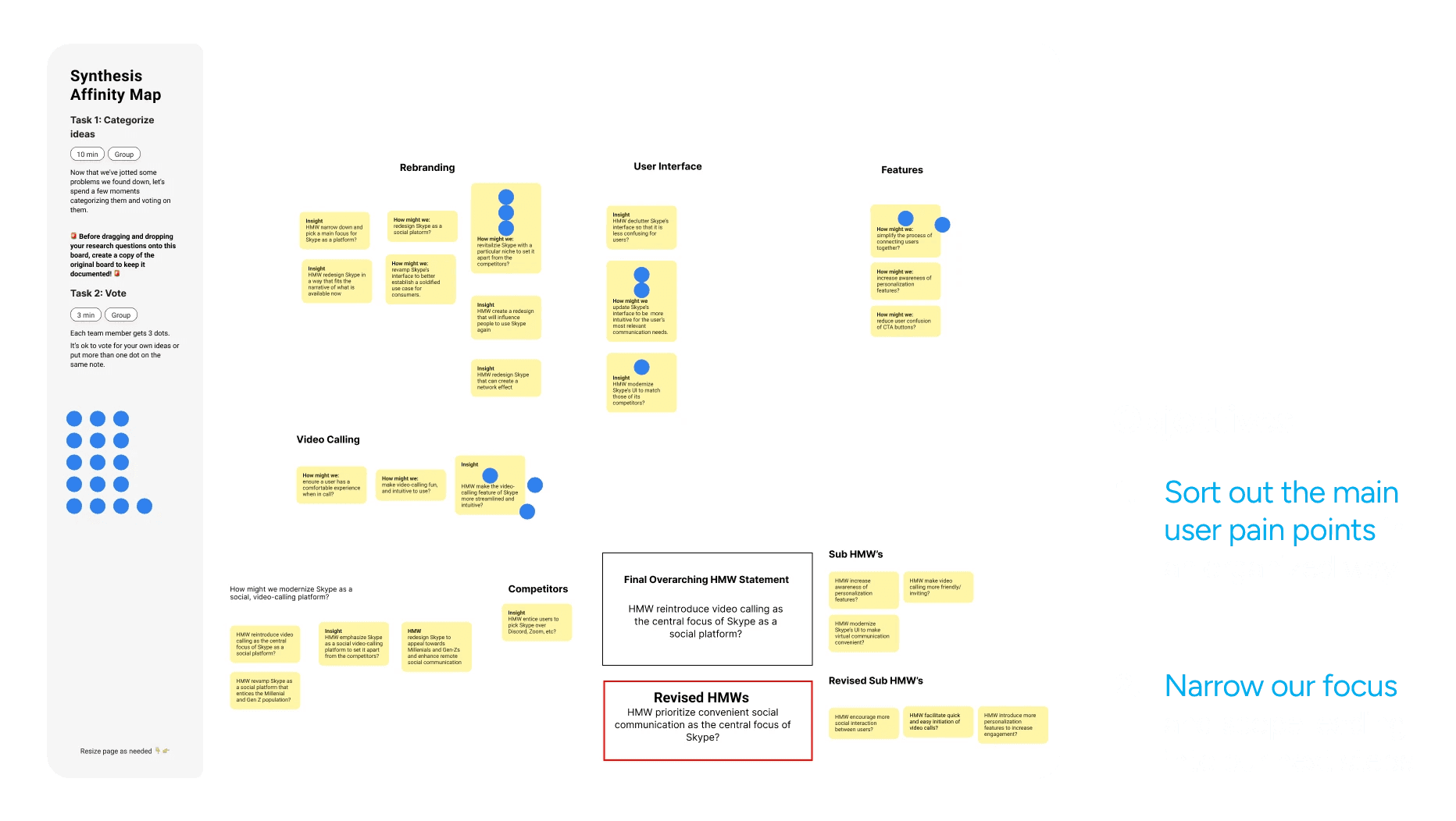
To analyze our data, we used an affinity map to identify recurring pain points and thoughts from our respondents. We then voted on areas to focus on and determined outdated user interface, ambiguous brand identity, and unintuitive video call flow and features as key areas for improvement. This led us to formulate a "how might we" statement to guide our design process.
The Problem Statement
How might we prioritize convenient communication as the central focus of Skype?
User Flows
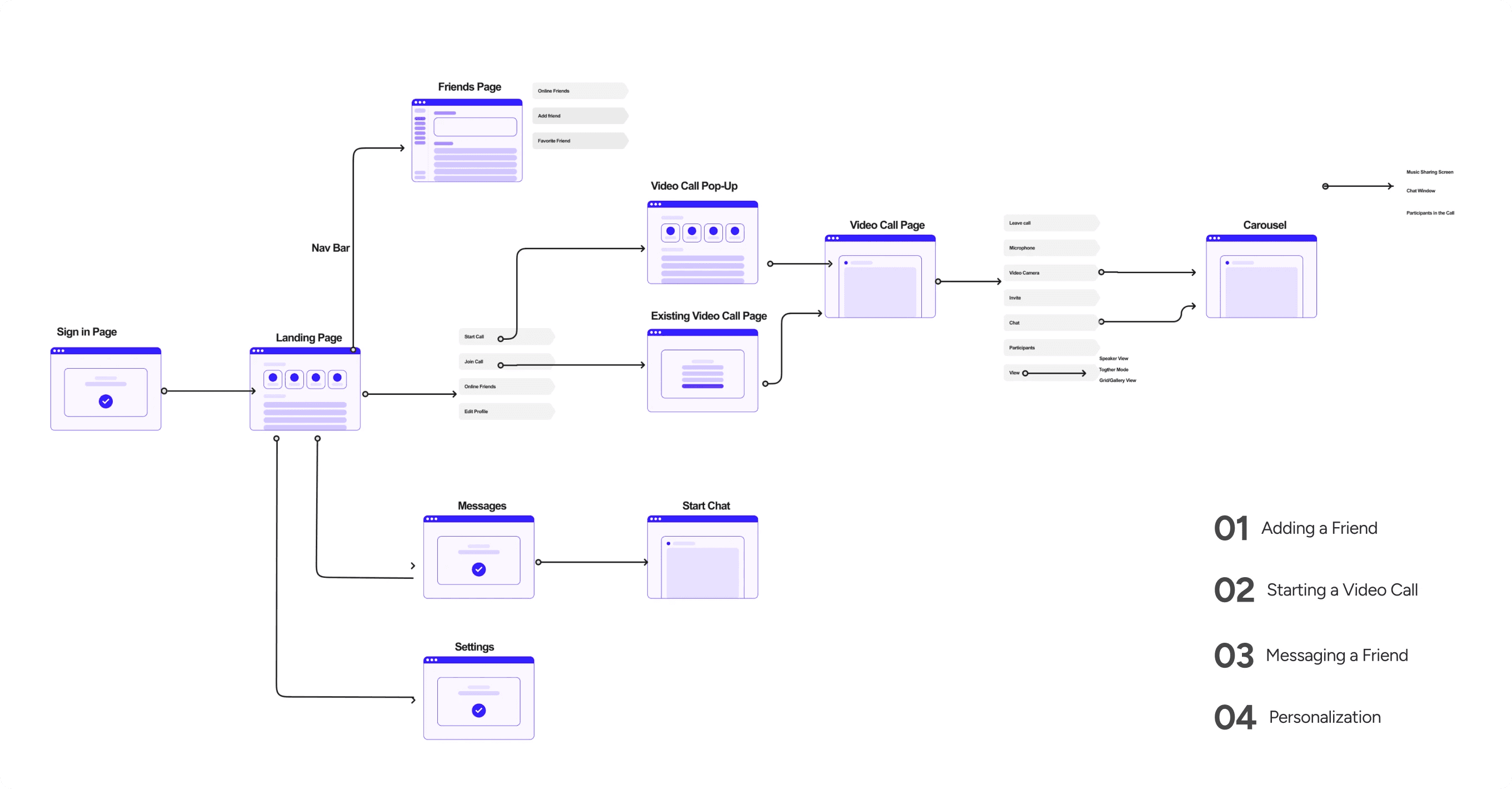
To guide us into our design sketches, I outlined some key flows to focus on when addressing our respondent’s pain points.
Solution Sketches
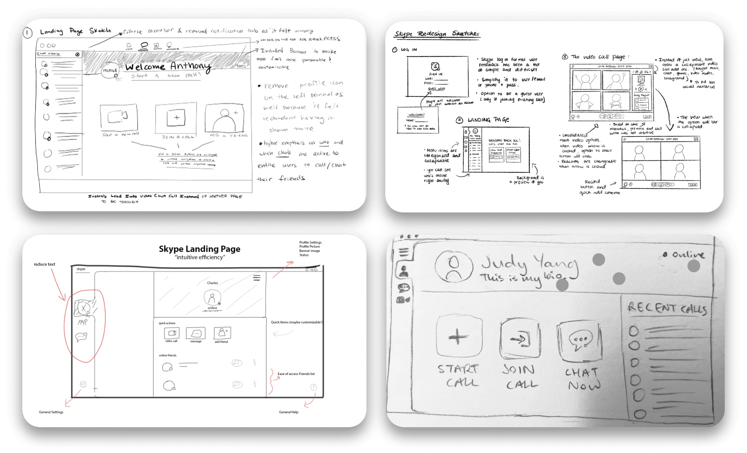
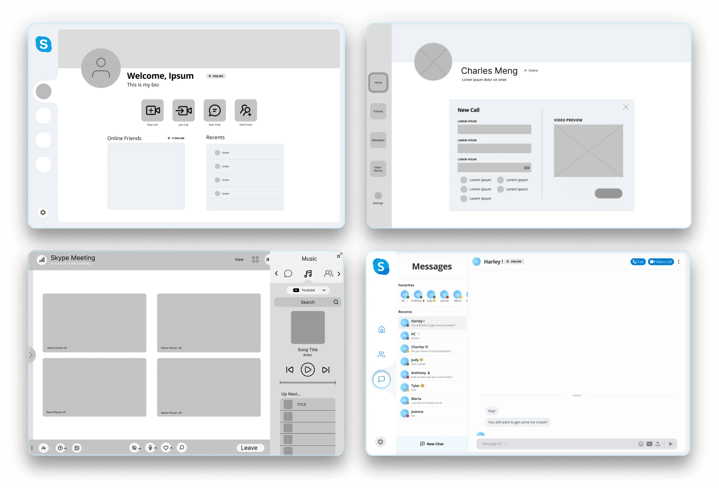
We generated ideas for our redesign, taking into account user flows and pain points. Our sketches were centered around the home/landing page, starting a call flow, and features of the video screen call. The team voted on key elements they liked from each sketch, and we worked to combine the most favorable ideas.
Mid-Fi Iterations
To create mid-fidelity designs, I refined each page and added Skype's branding for consistency. I prototyped user flows and solved pain points. I also experimented with features.
User Testing
Usability testing was conducted twice: once during the mid-fidelity sprint, and a second time after fine-tuning the product based on the first test. Twelve participants, all in their 20s and including students and full-time workers, took part in the testing, with six participants in each phase.
Each were given 4 tasks to complete:
01 Add a Friend from the Friends Page
02 Start a Video Call with Friends
03 Message Friends
04 Personalize your Home Page
Positive Feedback
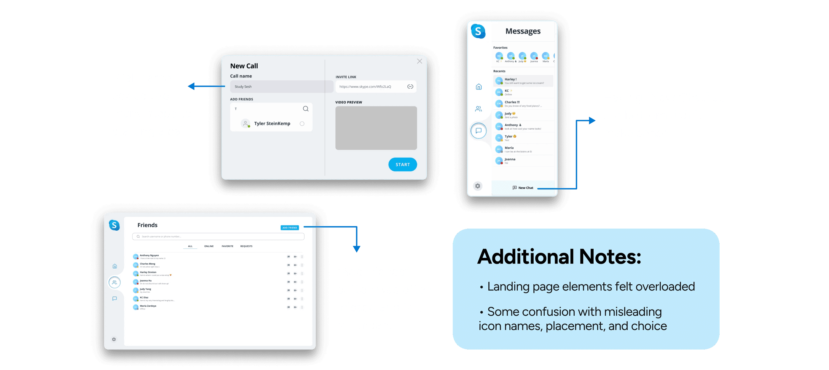
Overall, users had little trouble navigating through the different pages of our wireframes. In regards to specific features, users were satisfied when they were able to personalize their own profiles further. Within the video calling flows, users were especially drawn to the music tab.
Areas to Improve before Hi-Fi
Despite the positive elements, users encountered hurdles that created setbacks:
On the home page, the placement of the Favorites section felt awkward for users in terms of the purpose it served.
Consistency is needed with alignment and spacing throughout the interface.
Greater attention should be paid to creating color contrast and making the interface colorblind-friendly.
Make sure that every page is consistent in design style with each other.
Add labels to icons to make them more accessible.
The Design System

Over six weeks, I researched why Skype lost popularity and developed a solution to restore its prominence in telecommunications. My team and I presented our findings at Presentation Day, hosted by Design Interactive and sponsored by Netflix. Our presentation was well-received by industry professionals, and we were honored to win the Best UX Research Award.

Timeline

Understanding Business Value
Before conducting our research, I analyzed Skype's history and changes over time to better understand its business values. In recent years, Skype has lost popularity to newer platforms like Zoom and Google Meet.
There are a few reasons for this decline. First, the platform has become cluttered and difficult to use. Second, Skype's target market is not clear. The platform is trying to be both professional and social, which makes it difficult to define who it is marketed for.
To revitalize Skype, these values should include:
01 Convenience
Skype should be easy to use and navigate. Users should be able to find the features they need quickly and easily.
02 Security
Skype should be a secure platform for communication. Users should be confident that their data is safe.
03 Affordability
Skype should be an affordable platform for communication. Users should be able to use the platform without breaking the bank.
04 Scalability
Skype should be a scalable platform. The platform should be able to handle increasing demand without sacrificing performance.
Research
Surveys
Our survey received responses mostly from college-aged students, who generally reported infrequent use of Skype. Of those who responded, 51% had not used Skype in over four years, with 29% not having used it in the last two to three years. Respondents were drawn away from Skype as new alternatives like Zoom and Facetime began to arise.

Interviews
I then interviewed college students and full-time workers in their 20s to gather qualitative data and insights about our target audience. Our research questions included the following:
01 Why do people not want to use Skype?
02 Favored vs un-favored Skype features.
03 What’s missing from Skype?
I made sure to use open-ended questions and had the interviewees perform tasks on Skype's current design to identify initial problems.
Competitive Analysis

Ideation
User Personas

Affinity Mapping
To analyze our data, we used an affinity map to identify recurring pain points and thoughts from our respondents. We then voted on areas to focus on and determined outdated user interface, ambiguous brand identity, and unintuitive video call flow and features as key areas for improvement. This led us to formulate a "how might we" statement to guide our design process.

The Problem Statement
How might we prioritize convenient communication as the central focus of Skype?
User Flows
To guide us into our design sketches, I outlined some key flows to focus on when addressing our respondent’s pain points.

Solution Sketches
We generated ideas for our redesign, taking into account user flows and pain points. Our sketches were centered around the home/landing page, starting a call flow, and features of the video screen call. The team voted on key elements they liked from each sketch, and we worked to combine the most favorable ideas.

Mid-Fi Iterations
To create mid-fidelity designs, I refined each page and added Skype's branding for consistency. I prototyped user flows and solved pain points. I also experimented with features.

User Testing
Usability testing was conducted twice: once during the mid-fidelity sprint, and a second time after fine-tuning the product based on the first test. Twelve participants, all in their 20s and including students and full-time workers, took part in the testing, with six participants in each phase.
Each were given 4 tasks to complete:
01 Add a Friend from the Friends Page
02 Start a Video Call with Friends
03 Message Friends
04 Personalize your Home Page

Positive Feedback
Overall, users had little trouble navigating through the different pages of our wireframes. In regards to specific features, users were satisfied when they were able to personalize their own profiles further. Within the video calling flows, users were especially drawn to the music tab.
Areas to Improve before Hi-Fi
Despite the positive elements, users encountered hurdles that created setbacks:
On the home page, the placement of the Favorites section felt awkward for users in terms of the purpose it served.
Consistency is needed with alignment and spacing throughout the interface.
Greater attention should be paid to creating color contrast and making the interface colorblind-friendly.
Make sure that every page is consistent in design style with each other.
Add labels to icons to make them more accessible.
The Design System


Over six weeks, I researched why Skype lost popularity and developed a solution to restore its prominence in telecommunications. My team and I presented our findings at Presentation Day, hosted by Design Interactive and sponsored by Netflix. Our presentation was well-received by industry professionals, and we were honored to win the Best UX Research Award.

Timeline

Understanding Business Value
Before conducting our research, I analyzed Skype's history and changes over time to better understand its business values. In recent years, Skype has lost popularity to newer platforms like Zoom and Google Meet.
There are a few reasons for this decline. First, the platform has become cluttered and difficult to use. Second, Skype's target market is not clear. The platform is trying to be both professional and social, which makes it difficult to define who it is marketed for.
To revitalize Skype, these values should include:
01 Convenience
Skype should be easy to use and navigate. Users should be able to find the features they need quickly and easily.
02 Security
Skype should be a secure platform for communication. Users should be confident that their data is safe.
03 Affordability
Skype should be an affordable platform for communication. Users should be able to use the platform without breaking the bank.
04 Scalability
Skype should be a scalable platform. The platform should be able to handle increasing demand without sacrificing performance.
Research
Surveys
Our survey received responses mostly from college-aged students, who generally reported infrequent use of Skype. Of those who responded, 51% had not used Skype in over four years, with 29% not having used it in the last two to three years. Respondents were drawn away from Skype as new alternatives like Zoom and Facetime began to arise.

Interviews
I then interviewed college students and full-time workers in their 20s to gather qualitative data and insights about our target audience. Our research questions included the following:
01 Why do people not want to use Skype?
02 Favored vs un-favored Skype features.
03 What’s missing from Skype?
I made sure to use open-ended questions and had the interviewees perform tasks on Skype's current design to identify initial problems.
Competitive Analysis

Ideation
User Personas

Affinity Mapping
To analyze our data, we used an affinity map to identify recurring pain points and thoughts from our respondents. We then voted on areas to focus on and determined outdated user interface, ambiguous brand identity, and unintuitive video call flow and features as key areas for improvement. This led us to formulate a "how might we" statement to guide our design process.

The Problem Statement
How might we prioritize convenient communication as the central focus of Skype?
User Flows
To guide us into our design sketches, I outlined some key flows to focus on when addressing our respondent’s pain points.

Solution Sketches
We generated ideas for our redesign, taking into account user flows and pain points. Our sketches were centered around the home/landing page, starting a call flow, and features of the video screen call. The team voted on key elements they liked from each sketch, and we worked to combine the most favorable ideas.

Mid-Fi Iterations
To create mid-fidelity designs, I refined each page and added Skype's branding for consistency. I prototyped user flows and solved pain points. I also experimented with features.

User Testing
Usability testing was conducted twice: once during the mid-fidelity sprint, and a second time after fine-tuning the product based on the first test. Twelve participants, all in their 20s and including students and full-time workers, took part in the testing, with six participants in each phase.
Each were given 4 tasks to complete:
01 Add a Friend from the Friends Page
02 Start a Video Call with Friends
03 Message Friends
04 Personalize your Home Page

Positive Feedback
Overall, users had little trouble navigating through the different pages of our wireframes. In regards to specific features, users were satisfied when they were able to personalize their own profiles further. Within the video calling flows, users were especially drawn to the music tab.
Areas to Improve before Hi-Fi
Despite the positive elements, users encountered hurdles that created setbacks:
On the home page, the placement of the Favorites section felt awkward for users in terms of the purpose it served.
Consistency is needed with alignment and spacing throughout the interface.
Greater attention should be paid to creating color contrast and making the interface colorblind-friendly.
Make sure that every page is consistent in design style with each other.
Add labels to icons to make them more accessible.
The Design System


Over six weeks, I researched why Skype lost popularity and developed a solution to restore its prominence in telecommunications. My team and I presented our findings at Presentation Day, hosted by Design Interactive and sponsored by Netflix. Our presentation was well-received by industry professionals, and we were honored to win the Best UX Research Award.

Timeline

Understanding Business Value
Before conducting our research, I analyzed Skype's history and changes over time to better understand its business values. In recent years, Skype has lost popularity to newer platforms like Zoom and Google Meet.
There are a few reasons for this decline. First, the platform has become cluttered and difficult to use. Second, Skype's target market is not clear. The platform is trying to be both professional and social, which makes it difficult to define who it is marketed for.
To revitalize Skype, these values should include:
01 Convenience
Skype should be easy to use and navigate. Users should be able to find the features they need quickly and easily.
02 Security
Skype should be a secure platform for communication. Users should be confident that their data is safe.
03 Affordability
Skype should be an affordable platform for communication. Users should be able to use the platform without breaking the bank.
04 Scalability
Skype should be a scalable platform. The platform should be able to handle increasing demand without sacrificing performance.
Research
Surveys
Our survey received responses mostly from college-aged students, who generally reported infrequent use of Skype. Of those who responded, 51% had not used Skype in over four years, with 29% not having used it in the last two to three years. Respondents were drawn away from Skype as new alternatives like Zoom and Facetime began to arise.

Interviews
I then interviewed college students and full-time workers in their 20s to gather qualitative data and insights about our target audience. Our research questions included the following:
01 Why do people not want to use Skype?
02 Favored vs un-favored Skype features.
03 What’s missing from Skype?
I made sure to use open-ended questions and had the interviewees perform tasks on Skype's current design to identify initial problems.
Competitive Analysis

Ideation
User Personas

Affinity Mapping
To analyze our data, we used an affinity map to identify recurring pain points and thoughts from our respondents. We then voted on areas to focus on and determined outdated user interface, ambiguous brand identity, and unintuitive video call flow and features as key areas for improvement. This led us to formulate a "how might we" statement to guide our design process.

The Problem Statement
How might we prioritize convenient communication as the central focus of Skype?
User Flows
To guide us into our design sketches, I outlined some key flows to focus on when addressing our respondent’s pain points.

Solution Sketches
We generated ideas for our redesign, taking into account user flows and pain points. Our sketches were centered around the home/landing page, starting a call flow, and features of the video screen call. The team voted on key elements they liked from each sketch, and we worked to combine the most favorable ideas.

Mid-Fi Iterations
To create mid-fidelity designs, I refined each page and added Skype's branding for consistency. I prototyped user flows and solved pain points. I also experimented with features.

User Testing
Usability testing was conducted twice: once during the mid-fidelity sprint, and a second time after fine-tuning the product based on the first test. Twelve participants, all in their 20s and including students and full-time workers, took part in the testing, with six participants in each phase.
Each were given 4 tasks to complete:
01 Add a Friend from the Friends Page
02 Start a Video Call with Friends
03 Message Friends
04 Personalize your Home Page

Positive Feedback
Overall, users had little trouble navigating through the different pages of our wireframes. In regards to specific features, users were satisfied when they were able to personalize their own profiles further. Within the video calling flows, users were especially drawn to the music tab.
Areas to Improve before Hi-Fi
Despite the positive elements, users encountered hurdles that created setbacks:
On the home page, the placement of the Favorites section felt awkward for users in terms of the purpose it served.
Consistency is needed with alignment and spacing throughout the interface.
Greater attention should be paid to creating color contrast and making the interface colorblind-friendly.
Make sure that every page is consistent in design style with each other.
Add labels to icons to make them more accessible.
The Design System


02


03


© 2024 Krishelle Diaz
© 2024 Krishelle Diaz
© 2024 Krishelle Diaz
© 2024 Krishelle Diaz
